Thursday, 18 December 2008

Me-projects


FELTRON, Nicolas. 2006. 'The Feltron 2006 Annual Report' (extract). Available at: http://feltron.com/index.php?/content/2006_annual_report/P4/ [accessed 13/01/08]
Some interesting articles about the blurring of boundaries between design and conceptual art: including the increasing trend for designer monographs and self-initiated works, can be found on Johnson Banks' website, as referenced below:

BANKS, Jason. 2008. 'Thought For The Week: 18/12/08 Me-projects'. johnsonbanks.co.uk. Available at: http://www.johnsonbanks.co.uk/thoughtfortheweek/index.php?thoughtid=413 [accessed 18/12/08]
BANKS, Jason. 2008. 'Thought For The Week: 17/09/08 Dreaming about designer monographs'. johnsonbanks.co.uk. Available at:
http://www.johnsonbanks.co.uk/thoughtfortheweek/index.php?thoughtid=382 [accessed 18/12/08]

Thursday, 11 December 2008

Picking Up On Themes From Previous Work


Some of my recent research is picking up on themes that I started playing with during the short chair design project shown in the image above, back in 2005. (The actual poster also included 3d models and experiments which unfortunately don't appear here).

Richard Sweeney


I’ve been researching patterns and movement and have been thinking about using origami and paper folding to explore these ideas. Through this, I came across Richard Sweeney, and artists who’s work I’d not seen before.

http://www.flickr.com/photos/richardsweeney/tags/sculpture/

Sweeney uses paper and card to create patterns, objects, sculptures and other creative works. Projects have included a series of sculptural works in paper commissioned by Selfridges for display in the flagship store windows, Orchard Street, London, January 2008…

http://www.flickr.com/photos/richardsweeney/sets/72157603387509075/,

and a paper sculpture installation at the Stamp Staircase, Somerset House, London in October 08…

http://www.flickr.com/photos/richardsweeney/

Lighting and photography also play an important role in his work.

A Note On Pattern


I'm drawn to geometric pattern, both singly and in combinations. Take a quick wander around my home and you can see that pattern is evident both in the objects dotted around the house and the décor itself, as shown in the pictures above.

Saturday, 6 December 2008

A Note On Colour

There seems to have been a sudden injection of bright, juicy - almost saccharine - colour into my journal over the last couple of days… and I’m really enjoying it!

I’ve always had a strong awareness of colour and it plays an important part in the design choices I make; yet in my commercial capacity, opportunities to really push the boundaries and have fun with colour have been relatively limited. In mainstream graphic design, colour is used consciously and intelligently but it tends to be treated with caution – usually resulting in safe and sparing application of colour.

This MA could be my opportunity to reacquaint myself with a more experimental, expressive and dominant use of colour.

Snog


I've had these pictures bookmarked since I first came across them in June. Created by Ico Design and Cinimod Studio, Snog sells frozen yogurt.

Columbian architect Pablo Uribe and his US-born business partner Rob Baines '...wanted it to be British, fun, young and edgy,' says Ico Design's in-house writer Gerard Ivall, 'and that's where the name came from.'Visually, this has been translated into a 20 m2 space which aims 'to evoke the feeling of summer', says Uribe. Hence the floral wall graphics by Ico's Japanese illustrator Akira Chatani, and Cinimod's bright, stylish interiors.Marcel Wanders' Shitake latticed stools sit on 'English lawn' vinyl flooring, and are illuminated by a digital 'sky'.

Cinimod director Dominic Harris sees the ceiling as key to creating the 'perpetual summer' feel. 'More than 3000 individually controllable LEDs are deployed behind a Barrisol stretched plastic ceiling to create a bright, lightbox video surface,' he says. 'Digitally captured and manipulated clouds move gently above the store, their colour and speed determined by the time of day.'

Reference:
DOWDY, Clare. 2008. ‘The Taste Test’.
Design Week, 23(25), pp. 18-19.

Friday, 5 December 2008

I Want...


...to play with beautiful things all day like these guys do!

Interactive Dining At Inamo


Inamo's website tells us…
“Inamo is a pioneering Oriental fusion restaurant and bar where the control of the dining experience is placed firmly in your hands. Our mission is to provide delicious cuisine with charming and timely service in a warm and vibrant atmosphere.

At the core of Inamo is our interactive ordering system. Diners place orders from an illustrated food and drinks menu projected on to their table surface. You’ll set the mood, discover the local neighbourhood, and even order a taxi home. Our dedicated and friendly staff are always on hand to help with whatever you need.”
DuPont Corian was specified for the interactive tabletops at Inamo. Graphics and photographically illustrated menus are projected onto the Corian tables. Using a circular touchpad recessed into the tabletop, customers can then navigate their way through the dishes and send their order directly to the kitchen. They can also change the ambiance by selecting from differently coloured and patterned ‘virtual’ tablecloths, play games, watch a web-cam in the kitchen, browse local area information and even order a cab, all from the comfort of their tables.

http://www.inamo-restaurant.com/

Sunday, 30 November 2008

Blockers To Experimentation

Experimentation is a vital part of the creative design process, particularly for the designer-maker. It is something I enjoy doing and would like to do more of. So why is it that I seem to explore, rationalise and evaluate my designs early on, without even getting as far as experimenting with materials?

In her book “Hella Jongerius”, which portrays an interview that might have taken place, Schouwenberg says that,

“There is an incredible amount of intelligence involved in the making process itself. Trying to invent something by purely rational means rarely generates anything original. But working in my studio and pushing the envelope often yields surprises. So I let my materials and my intuition lead the way, and I put off looking for explanations to a later stage.” (Schouwenberg 2003: 60)

The image below shows a number of blockers I have identified to experimentation. Having identified these, I need to now look at ways of either removing or countering these, so that I can bring more experimentation into my work.


Citation reference: SCHOUWENBERG, Louise. 2003. Hella Jongerius. London: Phaidon Press Ltd.

Tuesday, 18 November 2008

Heart


When I first saw this, it didn't look like it would actually move: the shape didn't seem to lend itself to a cog system. Yet surprisingly it does, thanks to the three-dimensional cogs.

I like the way the heart shape explodes as the cogs move, and then slowly pulls back into shape after a few rotations.


You can see it in action on the link below...
http://www.youtube.com/watch?v=70dKZjP4NOo

A Desire For Functional Integrity


Belgian artist Wim Delvoye's art is extremely eclectic and can be grouped into different themes. Alongside his serious intentions, Delvoye's work often applies a sense of humour, at times risque and at others, disturbing, to create unique and challenging work.

The picture above is from his 'Chantier' project in which he rearranges the forms of gothic architecture to create sculptures of utilitarian building equipment. This piece is entitled Caterpillar#5, 350 x 900 x 300 cm, constructed from laser-cut corten steel.

The intricate metalwork is beautiful. In particular I like the way in which a usually heavy, indestructible modern piece of machinery appears here as an intricate, lace-like and seemingly fragile object of decoration.

This piece at first appealed to me as fitting well with the juxtaposition of aesthetic beauty and mechanics that I am currently exploring in my own research. However as I consider this piece further I am aware that its apparent link to mechanics is merely residual: an artefact of the original machinery, suggested only by form and not seen through in function.

This has alerted me to a threshold with which I may choose to constrain my own work. In the marriage of aesthetic beauty and mechanics, whilst beauty may be of paramount importance, I would like to maintain a level of mechanical and functional integrity. If my work suggests the presence of motion or function, then this should be realised and not simply implied.

That said, I am still drawn by its graceful, delicate visual qualities. Indeed I have already started working with perforated steel for its decorative and ageing qualities and I may choose to explore this further.

Monday, 17 November 2008

Where Am I Going?

As part of a group presentation today, I included a selection of pieces from other designers which I am drawn to – works which I aspire to, or which help me articulate the direction in which I would like to take my work. They were:

Wieki Somers' coat rack carousel, designed in place of a cloakroom for the new entrance of art and design museum Boijmans Van Beuningen. Visitors haul their coats up to the ceiling on a pulley, integrating their jackets into the exhibit (see earlier post for more on this).

Troika’s ‘All the time in the world’, which extends the conventional notion of a world clock. Rather than concentrating simply on capital cities in different time zones, this links real time to places with exciting and romantic associations including natural wonders, highest mountains, forgotten wonders, museums and modern wonders.

Troika’s ‘Cloud’, a 5 meter long digital sculpture whose surface is covered with 4638 flip-dots that can be individually addressed by a computer to animate the entire skin of the sculpture. Flip-dots were conventionally used in the 70s and 80s to create signs in train-stations and airports. The sound they generate is instantly reminiscent of travel.
http://www.youtube.com/watch?v=42hgPLL8IrA

Joshua Allen Harris’ inflatable street sculptures’, New York street art in the form animals made out of shopping bags positioned on subway street grates that cause them to periodically inflate and animate.
http://www.youtube.com/watch?v=7dOjahe0piE

Theo Jansen’s beach creatures (see earlier post for more on this).
http://uk.youtube.com/watch?v=b694exl_oZo


Through the act of speaking to the group about these pieces and why I like them, it helped me to recognise some common themes shared by some or all of these pieces…
  • Movement
  • Light
  • Use of mechanics
  • Art before need
  • One-off
  • Interaction
  • Surprise/pleasure
  • Location-specific.

These themes can also be found amongst the pieces previously identified and analysed as part of my earlier reflection (see my earlier post, “What Do I Like And Why?”).

I’d like to clarify these themes and elaborate on them a little further through my research moving forward, considering how they relate to my own work and my MA proposal.

Thursday, 13 November 2008

Theo Jansen's Beach Creatures: Art Or Science?

Despite having labeled myself for many years as "a creative", much of my work and interests seem closer to science or statistics than art. I like structure and order. I like things that work. I like working with numbers and diagrams. I like to carefully prepare, consider and calculate. I understand order and hierarchy. I avoid chaos and freefall. I am an organised worker.

These traits are not typical amongst my peers; so I was very interested when I came across the work of Theo Jansen.

Labeling himself as an artist and kinetic sculptor, he is also a physicist. Here is a man who comfortably blurs the boundaries between science and art; indeed in one of the videos linked to below he states that, "the walls between art and engineering exist only in our minds".


His Beach Creatures are the product of 16 years of work - work which continues today. A heady mix of science, art and nature, they move gracefully across the landscape and seemingly take on a life of their own.


These creatures fascinate me (if indeed they are creatures at all). I am delighted by the way they move and they are made even more remarkable by their use of mechanics over computers for artificial intelligence. I am also intrigued by the idea that they can become self-sustaining, challenge our ideas of intelligence and of life.

I am inspired to explore kinetic sculpture further. I look forward to seeing how this might fit with my work.

Wieki Somers' Coat Rack Carousel

Working under the name Haunting Dogs Full of Grace, Dutch designers Jurgen Bey, Ted Noten, Wieki Somers, Bertjan Pot, Simon Heijdens and Frank Bruggeman have created works for the new entrance of art and design museum Boijmans Van Beuningen.

Rather than behaving as interior designers, the group took a conceptual approach. They were interested in visitors experiencing design, turning mundane situations like hanging your coat into a process to enjoy. In doing-so they were demonstrating how conceptual thinking can be integrated into everyday experiences.

For one of the pieces, Wieki Somers designed a coat rack carousel in place of a cloakroom, shown above. Visitors haul their coats up to the ceiling on a pulley, integrating their jackets into the exhibit.

Two things in particular attract me to this piece of work. The first is how beautiful it looks: the light and colour dance around to give it a chandelier-like quality, made all the more striking by its large scale. The second is the way in which the piece has been specifically designed for engagement and contribution by its audience. Rather than creating an installation which is precious, to be seen but not touched, an important part of its concept is its functional use. Visitors are invited to contribute to it by the addition of their own coat: certainly more engaging that passing your coat through a hatch!

http://www.iconeye.com/index.php?view=article&catid=1%3Alatest-news&layout=news&id=3488%3Aboijmans-van-beuningen&option=com_content&Itemid=18

Saturday, 8 November 2008

Thursday, 6 November 2008

Things I’m Learning About Myself

  • My heart usually knows the right answer long before my head does. My heart tells me the answer, then I use my head to validate it and make it happen.
  • In my head I'm a designer; in my heart I’m an artist.
  • My work is a performance, my job a stage. My peers, my clients and their clients are my audience.
  • I like to plan.
  • Being spontaneous makes me uncomfortable. I like to know that I’m doing the right thing in the right way.
  • Problems are like sculptures: I chip away at them until the whole answer is revealed.
  • I always have the answer, but sometimes it takes time to find it.
  • Time is a tool, not a constraint. Time enables planning. Time allows me to check I’m doing the right thing before I commit to it.
  • Time is valuable; time should never be squandered.
  • ‘Can’t be bothered’ is not acceptable.
  • I am not bad at making decisions – I simply require time to make an informed decision. Once a decision’s made, I rarely come to view it as the wrong one.
  • I love to learn.
  • If a project isn’t challenging, I lose interest.
  • Looking backwards is good, looking sideways is good, but I am only interested in moving forwards.
  • Mistakes are important – they help make me better. The only bad mistakes are those that I repeat.
  • I am only interested in doing things I believe I can do well.
  • I do everything as if it will be looked back upon in the future. I throw none of my work away.
  • I stop only when I’m satisfied with the outcome.
  • I find failure difficult to accept.
  • I believe in helping and supporting others as a means of paying back those who have helped and supported me.

Monday, 3 November 2008

What Do I Like And Why?

What is it about the things I like that makes them special to me? Do they appeal on purely an aesthetic level or is my response more complex? Are there common traits or themes that link the things that appeal to me together?

In an effort to answer these questions and others, I pulled together a list of items I like. I wanted to analyse what it is that makes these things special to me and how I might be responding to them.

This list included all manner of media. It also included both my own work and that of other designers and artists.

I imposed just one restriction on myself when drawing up this list: I didn't hunt down new things for the purpose of this exercise. Often, something that appeals to me initially doesn't stand the test of time. Its appeal is short lived, triggered perhaps by what I'm exploring or experiencing at that point in time or a curiosity generated on first viewing but which dwindles once the surprise has gone. I felt that, by imposing this restriction, it would help me ensure that the things included were proven as things I like; indeed, I often actively use a cooling-off period as part of my design decision-making process.

After making a list of things I like, I obtained an image of each. I put each image on a single card and printed these cards out. I then considered each item in turn, writing brief notes on each card about what I liked about the item and why.


Producing cards in this way then enabled me to shuffle them around in groups, as I thought through and studied the possible commonalities and relationships between each of the items I like.

I identified a number of words and descriptions that frequently appeared. As with the cards, I printed these out and arranged them into common groups. In doing this, I identified four key levels upon which I appear to respond: emotional, experiential, structural and aesthetic.


The next stage was to establish whether some responses were more important to me than others. To help me do this, I drew up a matrix of the items I had chosen and the identified responses. I then moved through the following steps:

  1. I marked the responses that I felt were prevalent for each item.

  2. I counted the number of times each response occurred across all the items. This helped me identify the most commonly occurring responses.

  3. I scored each item by the number of positive responses I had marked against it. I then ordered the items in the matrix so that the highest scoring items appeared highest on the list. (As a general observation, those which I would have selected as my most favourite did appear at the top of the list, whilst those which I favoured less appeared lower down in the list.)

  4. I assessed each item and tried to established which of the four response groups was of greatest value in its overall appeal to me.
A copy of the matrix can be viewed on the following link:

http://dl.getdropbox.com/u/225991/MA%20Design/ThingsILike_matrix.pdf

Through this exercise I can see that I am mostly drawn to the responses I termed as Experiential and Structural. Emotional and Aesthetic responses feature less heavily in the things I like.

As a cautionary note, I am uncertain as to the statistical validity of this exercise: at times I found it difficult to pinpoint exactly what it was I liked, and liked most, about each of the items as this is highly subjective. Furthermore I doubt that I would achieve exactly the same outcomes if I were to repeat this exercise again at a future point. However, I do feel that it has been a useful step in helping me to decode my tastes, and to identify the aspects of a design that appeal to me most.

Friday, 31 October 2008

Unwise Words: Trick Or Treat?

I was doing a bit of research yesterday when I stumbled across this blog article:

http://www.creativereview.co.uk/crblog/creative-review%c2%ae-launches-bold-new-brand-identity/

As I read through it, what started out as mild interest turned quickly into disbelief. As I moved through the article, I started to read phrases out loud to my husband sitting next to me (a fellow designer himself). We shrieked and winced in disbelief: this was exactly the kind of pretentious nonsense that builds barriers between the creative fraternity and the cautious, risk-averse small business people that make up a significant portion of our client base.

As we got to the end of the piece, my husband suggested that surely this was a prank. It didn't take much digging around to find that in fact, he was right.

http://www.creativereview.co.uk/crblog/it-was-a-send-up-but-the-language-is-horribly-real/

The article on this second link captures very well the feelings I have about the more pretentious side of the design industry.

Trying to shore up your concept with fancy words and tenuous phrases can be tempting, especially when you're charging a not insignificant amount of hard cash for what results in a 10cm piece of logo artwork. Indeed, there are even clients who enjoy having this kind of blurb on hand to thrust at the Board, in an effort to justify their spending; but as a designer, I hope I can communicate on a level with the rest of the world. I want my designs to speak for themselves. I want people's reaction to my designs to be personal and instinctive, not contrived and conscious.

Thursday, 30 October 2008

BMW & The Prodigy


YOUTUBE.COM. 'BMW - 1 Series Advert (07/05/07)'. Available at: http://www.youtube.com/watch?v=7adPhli-SyE [Accessed 23/04/09]

I find this advert absolutely fascinating.

Some of the effects remind me of a very early pop video, with the kaleidoscope effect and simple inverted images.

The addition of graphic marks and pattern brings it up-to-date (for the time it was released, circa 2004).

The image of the wobbly newborn foal is slightly uncomfortable to watch - not just as it struggles to stand but also the eerie way it's duplicated and superimposed on a very clinical white background.

The combination of organic images mixed with images of high-tech, mecahnical BMW detailing works well.

The effect of pattern created from repeats of the organic images is visually interesting and was cutting-edge style wise at the time of creation.

The rhythm of the moving images and the audio track compliment each other perfectly.

Ad details...

Agency: WCRS / Music: The Prodigy - You'll be under my wheels

VISIT4INFO.COM. 'BMW Car Range - BMW 1 Series' (31/07/04). Available at: http://www.visit4info.com/advert/BMW-1-Series-BMW-Car-Range/16404 [Accessed: 23/04/09]

Saturday, 18 October 2008

Food For Thought


I’ve always been drawn to using materials out of their typical context; I like the way it forces me to look at things in a new light and to notice characteristics that I might have previously overlooked.

These pictures are from a series of award-winning images by artist Claire Grove, published as greetings cards by Holy Mackerel: a whitty and charming collection of mini-environments, created using models of people placed into food landscapes.

These pictures don’t just make me look at food from a different perspective. They also serve to remind me of some fundamental principles of spatial design that I would do well to remember… that scale plays a huge part in the overall effect of a design [1]; that users of a space become a part of it [2]; that a successful space will always be one that’s designed with the user in mind [3]; and that my work doesn’t always have to be quite so serious!


http://clairegrove.co.uk/index.php?pr=Cards_and_prints

[1] Part of the charm of these images is their scale.
[2] Take the figures away, and the landscapes become meaningless.
[3] I imagine that the figures came first, and the settings were designed based on the suggested activities of the figures.


Friday, 17 October 2008

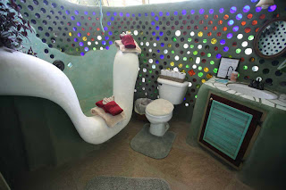
Michael Reynolds, Garbage Warrior


By many people’s standards, I don’t watch much telly. I struggle enough to fit my life into 24-hour chunks as it is, without having to make time for telly as well. So it’s a wonder that I stumbled upon More4’s documentary last Tuesday entitled “True Stories: Garbage Warrior”, a documentary looking at the work of eco-friendly architect Michael Reynolds. And how pleased I am that I did!

Somewhat of a maverick in his field, Reynolds has been experimenting with his 'biotecture' in the New Mexico desert for the last 35 years. He’s convinced that humanity is headed for oblivion due to our depletion of the Earth's resources and pollution of the environment: “I'm trying to save my ass - and that is a powerful force”, he says.

Reynolds builds self-sufficient, off-the-grid 'earthships' out of old beer cans, bottles and tyres hard-packed with earth. His seemingly magical buildings use power from the sun, harvest rainwater and treat their own sewage, meaning that they are not reliant on any infrastructure.


Surprisingly, despite their make-up and their low-tech construction, his buildings are beautiful and enchanting. And proven to work: as well as living in them himself for many years, his earthships have literally saved the lives of tsunami victims in the Andaman Islands left homeless and waterless after their villages were flattened.

Reynold’s buildings are beautiful and fascinating to look at. Moreover they are immensely sustainable, boasting a build of natural and recycled materials, thermal/solar heating and cooling, solar and wind technology, water harvesting, contained sewage treatment and food production – and a construction time of 15 days to boot.

Yet what strikes me most about Reynolds work isn’t simply the remarkable design of his structures. It’s his drive and determination to push his work forward, despite some seemingly insurmountable bureaucratic hurdles and a lack of vision or support from US authorities – which has even resulted in him having his architect’s licence revoked for a period of time.

Reynolds’ determination is remarkable. He fights endlessly to push the boundaries of architecture and sustainable building and his life and his work are inseparable. Clarity of vision is the lifeblood of his achievements.

http://www.earthship.net/modules.php?name=News&file=article&sid=4